Here We Go Again: A Website Overhaul Story
Thirteen years ago, I started a blog in preparation for leaving my job and taking some time off to travel and explore. Gentleman of Leisure, Student of Life is actually still alive today, and I suppose will continue to exist for as long as Google wants to keep Blogger on life support. My very first post gives a bit of context and outlines my hopes for what writing could accomplish.
Four years (and many adventures) later, I relaunched that blog as a standalone, WordPress-powered website that I controlled myself. I gave it a brief mention in my 2016 year-end wrap-up, which includes a hauntingly inaccurate prediction:
I’m sure I’ll blog about my travels, but since I’m working full-time and no longer on a sabbatical, I’ll have much less travel content than before. Maybe I’ll write about tech or San Francisco or photography. We’ll see.
Gulp. Well, unfortunately, this has not really come to pass, and is in fact the same thing I’m telling myself now! But I really mean it this time. (eyes dart back and forth nervously)
Over the last nine years, I migrated that site several times between hosting providers – from Siteground to Google Cloud to Digital Ocean – but kept the core mostly untouched, even while WordPress and the web community at large kept moving forward. I kept writing occasionally, but didn’t invest any time or effort into site improvements.
Fast forward to 2026, when it dawned on me that my website was feeling outdated or clunky or just sub-par on several fronts. As I jotted down ideas for different improvements I could make, I soon realized my list covered pretty much every aspect of the website. I was looking at a pretty major overhaul. All the raw content (blog posts and photos) would remain untouched, but it was starting to seem like everything else would have to change. Time had just finally caught up, as it usually does.
Things get a little technical below, but I’ll try to keep it interesting. Let’s dive in!
Domain Name🔗
The initial driver for change – especially the timeline – was actually my domain name expiring. I had registered my old kylegetz.me domain years ago, but it was starting to feel dated, as the .me concept for domain names never quite caught on. I was also feeling a little uncomfortable with putting my full name in the domain name; it felt a little too vulnerable and open. Now that we live in an era of much more pronounced government spying, cyberattacks, and security breaches, I’m more careful with how much personal information I put out in the world.
Instead of creating a digital biography or online CV, I wanted my site to be more of a flow of stories and random musings, but also a place where I can post photos and photo albums, all with a playful branding. I was actually stuck on picking a new name for months earlier this year, and this was holding up the entire pipeline of tasks, since I needed a domain name before I could make changes to my hosting arrangement.
I spent a lot of time using AI chatbots and the thesaurus to brainstorm names that would capture what I was going for, which admittedly was a little nebulous. I forget exactly how I came upon the final choice – my chatbot history seems to be missing here – but “Wandering Thoughts” captured the essence perfectly: a nod to the fact that most of my content is about traveling, but also an admission that my writing could be about other random topics as well.
I briefly entertained the idea of a creative domain name suffix – .xyz seems to be popular with the kids these days – but in the end, I wanted a tried-and-true .com website. Sometimes simplest is best. After buying the new domain with Squarespace Domains – who took over Google’s domain name business – I was off and running!
Hosting🔗
For the last few years, I’ve been quasi-self-hosting my WordPress installation on a virtual machine with Digital Ocean (they call them “droplets”). This was working decently well, but over time I found myself increasingly weary from having to manage my own Linux VM. Package and OS updates were solely my responsibility. If anything broke, it was on me alone to fix things (or restore from backup, which I had to do at least once). Moreover, it was impossible for me to easily upgrade from the older version of Ubuntu my VM was running; without physical access, you really can’t upgrade an OS safely. The official guidance from Digital Ocean tech support was to create a new droplet with the desired Ubuntu version, and then do a WordPress migration across droplets.
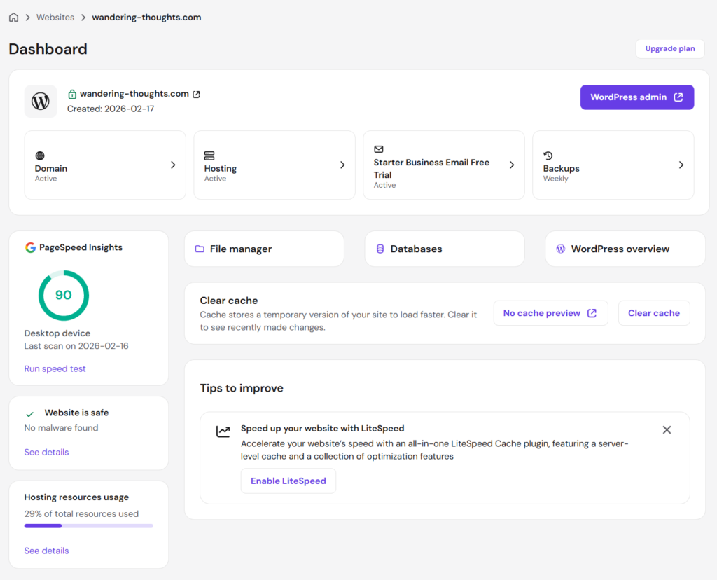
This was starting to sound like a lot of work, plus I would have to do this again and again for every Ubuntu upgrade in the future. I decided that it was too much hassle and anxiety to run my own VM, especially for something as commonplace as WordPress. Hosting providers with WordPress support are a dime a dozen these days, so I pored over lots of independent reviews and blog posts to get a sense of the hosting landscape these days. My needs are relatively simple – I have a low-stakes, low-traffic personal website with zero commerce – so I looked around for the lowest cost I could find (but still with a reputable company). Hostinger happens to be running a promotion these days where you get 4 years of hosting for $72. Total! That’s an unbeatable deal, and they have good reviews, so I signed up.
Writing this post several months after making that decision, I can say it was a good one for technical reasons too. The Hostinger admin interface is really clean and easy to use, does not use cPanel (a dated dashboard interface still used by a lot of hosting providers), and has that “calming purple” accent color that I appreciate (e.g. Wealthfront, Twitch, or HBO Max). Most importantly, the connection to my website has been super fast; I’ve been doing a lot of work on it over the past few months and pages load instantly, every time.
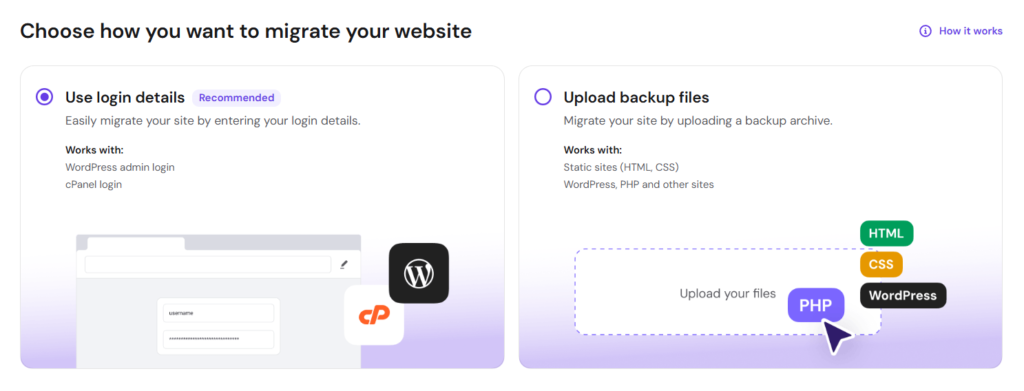
Crucially, Hostinger also has first-class support for migrating an external WordPress site, either via direct login or by importing a backup archive. I gave it the credentials for my old site, let it run for a little while, and voila! My entire site was migrated perfectly.
WordPress Studio🔗
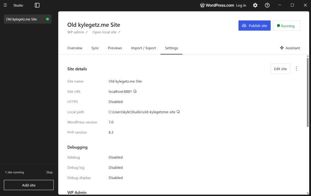
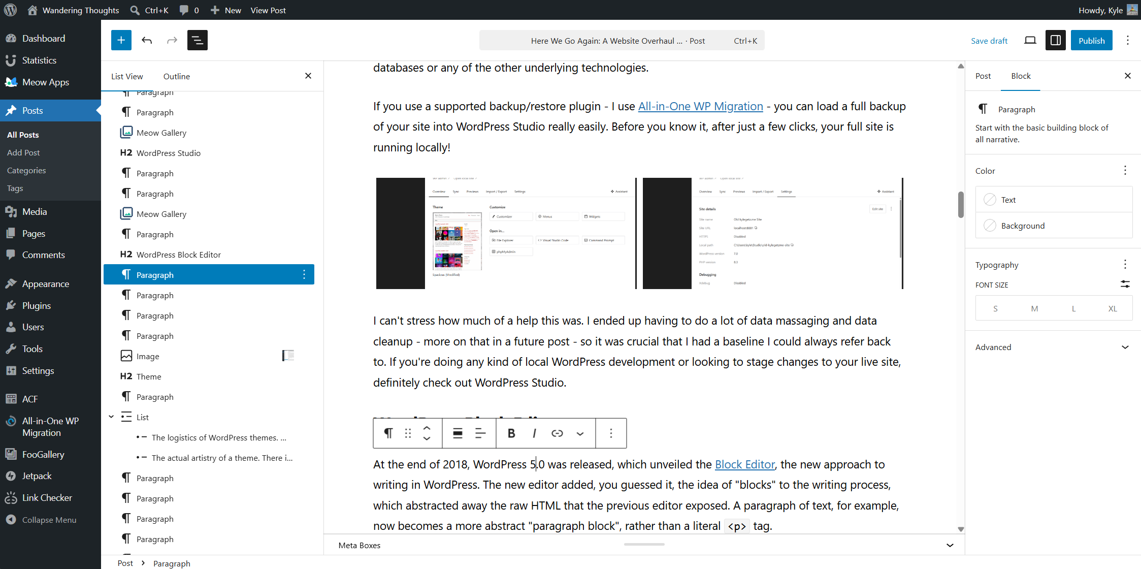
Even though I really tried to get started on this migration well before the expiration date of my old domain name, everything took longer than I expected, so the name expired while I still had a lot left to do. This wasn’t a big deal in terms of continuity – I was okay with the site being offline for a bit – but it did mean I no longer had access to the old site as a reference. That’s when WordPress Studio came to the rescue: it’s a slick and easy way to run a full WordPress site locally, without having to deal with PHP or databases or any of the other underlying technologies.
If you use a supported backup/restore plugin – I use All-in-One WP Migration – you can load a full backup of your site into WordPress Studio really easily. Before you know it, after just a few clicks, your full site is running locally!
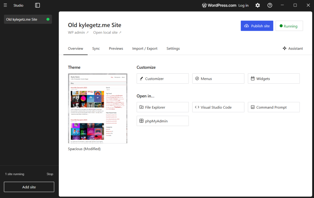
I can’t stress how much of a help this was. I ended up having to do a lot of data massaging and data cleanup – more on that in a future post – so it was crucial that I had a baseline I could always refer back to. If you’re doing any kind of local WordPress development or looking to stage changes to your live site, definitely check out WordPress Studio.
WordPress Block Editor🔗
At the end of 2018, WordPress 5.0 was released, which unveiled the Block Editor, the new approach to writing in WordPress. The new editor added, you guessed it, the idea of “blocks” to the writing process, which abstracted away the raw HTML that the previous editor exposed. A paragraph of text, for example, now becomes a more abstract “paragraph block”, rather than a literal <p> tag.
I can admit today that this is a great idea and takes away a lot of the pain of managing WordPress pages and posts. But at the time, I couldn’t be bothered with this annoying upheaval, so I continued using the “classic editor”. And since I didn’t invest any effort into keeping the site modernized, I’ve continued using the old-school way for the last 7+ years.
As part of the site overhaul, I swallowed my pride, uninstalled the classic editor plugin, and migrated everything to blocks. Much to my surprise, the migration was pretty straightforward and easy. There was some minor post-migration cleanup required and a few things had to be fixed by hand, but by and large, it was a smooth transition.
Once I was on the other side, I started to realize the benefits immediately. Embedding media like Spotify playlists or YouTube videos is now trivial, since WordPress has blocks specifically for those purposes. Now that everything is a higher-level abstraction, the editor interface can show you a block list view or outline to the side of your post, which is really helpful for navigating your post or managing blocks. Since migrating, I have not had to dive down to the raw HTML once (something I had to do often before).
Theme🔗
The theme was the most difficult undertaking of everything I did. Unlike every other task, which more or less had a “correct answer” to strive for, the theme was wide open. I had some ideas in mind that I wanted to play around with, but actually making those thoughts a reality was going to be a challenge. Broadly speaking, there were two categories of challenges:
- The logistics of WordPress themes. WordPress themes are not simply color palettes or stylesheets; they include a lot of PHP and JavaScript. Server-side templating languages (like PHP) are notoriously horrible to read and write because they mix multiple languages into the same file. I find WordPress PHP to be some of the worst-looking and least-maintainable code I’ve ever seen.
- The actual artistry of a theme. There is an infinite number of possibilities here and I had to settle on something that I felt was appropriate for my “brand”. I’m also not a designer!
I definitely didn’t have the time to make a new theme from scratch, so I decided I would try to find an existing theme that was “close enough” and then tweak it to suit my needs. (This is exactly what I had done with the previous site too.) I spent a few weeks trying out all the popular themes from every “Best WordPress Themes for 2026” listicle I could find. Thankfully, WordPress makes this kind of iterating incredibly easy: you can install and activate a new theme in mere seconds, play around with it a bit, decide you don’t like it, and finally uninstall it in a fit of rage, all in less than a minute. Such efficiency!
Eventually I settled on the Ashe Pro theme and even ponied up $30 for a lifetime license. It’s not perfect, but out of everything I had tried, it felt the closest to what I wanted and seemed to have some professionalism to it. As I settled into configuring it, I realized it was still going to require a lot of changes under the hood, but at least I had a decent foundation to start from.
The company that makes the theme claims to offer support, but I found out pretty quickly that their support was a joke. I opened tickets for all the small bugs I found and for basic features that I felt were missing; the company wrote back and said I had submitted so many tickets that they were all being flagged as spam. It was soon evident that I would have to fix everything on my own. If you want something done right…
Taking matters into my hands, I created a new private GitHub repository, unzipped the theme into it, fired up Visual Studio Code, installed the Claude Code extension, and got to work fixing all the problems I had encountered. Some of the issues I had filed tickets about were literally one-line fixes that took Claude only a few seconds. Weird letter spacing? Haphazardly sorted lists? No support for true italic fonts? Fixed. Fixed. Fixed. I even had Claude remove all the upselling and affiliate garbage that the theme was adding to my WordPress admin interface.
As a software developer whose livelihood will being threatened by AI, these capabilities are alarming, especially in how much they’ve improved in just the last six months. But I have to say, as a user of open-source software, it’s truly liberating that I can easily fix software deficiencies myself, without waiting on a clueless or indifferent company. Software vendors and authors that don’t wake up to this reality are going to find themselves out of business astonishingly fast.
Eventually I fixed all the annoying issues I had noticed and turned my attention to small tweaks and improvements. Everything I had added to the “Additional CSS” area in the WordPress theme customizer I moved into the theme itself, safely duplicated to my GitHub account via a long string of commits. I spent a lot of time iterating on different design ideas until I converged on something that captured the vibe: simple, clean, modern, mostly stays out of the way of the content, but has a little personality unto itself.
With respect to the “I hate PHP” obstacle, Claude Code was invaluable here. It’s no longer necessary to understand the weirdly organized pile of spaghetti – just have AI do it for you. Claude was able to easily change everything I didn’t like, whether it was fixing PHP logic or modifying responsive CSS styles or adding a bit of JavaScript.
After a lot of dead-ends, iterations, and trial and error, I’ve converged on something that I’m happy to put out into the world. Is it perfect, or even final? No to both – I’ll keep tweaking things in the future. But it’s something I enjoy looking at, which is good enough for now.
Responsive Design🔗
I’ve spent more time in the last two weeks using Chrome’s device toolbar than in all my years prior. To the credit of the theme authors, Ashe Pro does make responsive design a first-class citizen, so I had a pretty good base to start from. But as I made my own (unsanctioned) changes to the theme, I had to keep testing and re-testing on a variety of screen sizes, with each fix or improvement leading to another bug somewhere.
The dimension presets in the toolbar are really helpful, and I ended up using the following in my testing (from largest to smallest): iPad Pro, iPad Air, iPad Mini, iPhone 14 Pro Max, and iPhone SE. Once I was happy with how the site looked in Chrome dev tools, I then tested with my actual phone and tablet. Viewing your website on a real device in the palm of your hand is a very different experience than the simulated one inside a desktop browser.
I ended up investing a surprising amount of time into this and I’m pretty happy with where I ended up: the site looks good – and consistent! – on a wide range of screen sizes. CSS media queries are pretty powerful once you know how to harness them.
Logo🔗
This was maybe the most whimsical activity, but it was something I had been kicking around in my head for a little while. I have a photo of myself from the beginning of my traveling sabbatical (Day 4 or so), while on the first boat ride of many. I’ve used a cropped, partially-monochrome version of this photo as a profile photo in lots of places; I’ve always really liked it for its “heading off on an adventure” feeling, which is quite literally what I was doing at the time. Since Claude doesn’t do image generation, I took this task to Gemini and fought with it for a while until I was happy with the result. (I find that Gemini often knocks it out of the park on the first try, if you’re not too fussy on the details. If you want very specific changes, Gemini can be infuriatingly stubborn.)


In the end, I’m pretty happy with the result – a fun “sunset traveler” vibe. This new logo is on the About page, in the main navigation bar above, and is also the favicon.
Colors🔗
I wanted the sunset colors from the logo to play a part in each page on the site in a subtle way. Moving from top to bottom, the logo background colors show up in the following places:
- The main navigation bar has deep purple for the link hover color and bottom border
- A “blue hour” blue is used for links in the body of the page
- A terracotta / dark rose is used for tags and for the hover color of “You My Also Like” links
- The footer has a burnt orange for its border and icon hover effect
- The scroll-to-top button has deep purple for its hover effect since it “takes you back to purple”
If you look closely, you’ll also see that the background color is a gradient from a cool gray to a warm gray, which goes nicely with the changing accent colors as you scroll down the page.
Photos (Inline)🔗
According to some of my readers – and who am I to disagree? – the inline photos in my posts are the heart and soul of the entire site, so I didn’t want to mess with them too much. But a couple things about them had always bothered me:
- The one-at-a-time, serial display takes up a lot of height and requires a lot of scrolling to get through
- The lightbox always felt a little sluggish and not modern enough
I spent some time trying out a lot of the gallery plugins and eventually settled on two of them, for slightly different use cases (more on this below). For inline photos, I am now using Meow Gallery and Meow Lightbox, part of the incredibly excellent Meow Apps suite of WordPress plugins. I have since adopted more of the plugins from this suite, which I’ll talk about more in a separate post in the near future.
Meow Gallery supports several different layout types, but the default “tiles” layout works so well I didn’t bother with anything else. Photos are resized dynamically so that they always fit perfectly in the space, and clicking any photo opens the accompanying lightbox. I believe you can use any lightbox plugin – you don’t have to use the Meow Apps one – but why would you? It’s amazing how much better this lightbox is than my previous one: it’s incredibly fast and snappy, responsive to keyboard, mouse, and touchscreen input, and has a really nice EXIF metadata display. It also lets the user flip through all the photos in the entire post – not just the photos in the current gallery – which is a must-have feature that some other lightbox plugins I tried don’t actually have.
Converting my previous “runs” of images into Meow galleries would normally be a pretty daunting task – manual, error-prone, and tedious – but Claude was able to handle this for me with style. I’ll be writing a separate post soon to talk about all the miscellaneous tasks that Claude was able to do for me.
Photos (Gallery)🔗
The Gallery page is where I have links to all of my full photo albums (hosted on Google Photos). In the old site, I had actually coded my own gallery in vanilla JavaScript, in a way that was a bit janky, but also lovably, adorably functional. If memory serves, I wrote it nearly 10 years ago, in a cafe in Luang Prabang, cobbling together bits of jQuery from the web with a hacky, faux-implementation of React, and throwing Bootstrap on top. Here’s what part of it looked like:
function renderThumbnails(prefix, url) {
  var container = jQuery('<div class="row"></div>');

  for (var i = 0; i < IMG_CLASSES.length; i++) {
    var column = jQuery('<div class="' + IMG_CLASSES[i] + '"></div>');
    container.append(column);
    column.append(
      '<a class="album-thumbnail" href="' + url + '" target="_blank" title="' + IMG_TITLE + '">' +
        '<img src="/wp-content/uploads/' + prefix + '-' + (i + 1) + '.jpg" />' +
      '</a>'
    );
  }

  return container;
}

function renderAlbum(album) {
  var container = jQuery('<div class="album"></div>');
  container.append(renderHeader(album.name, album.date, album.blog, !!album.warning));
  container.append(renderThumbnails(album.prefix, album.gallery));
  return container;
}Once I got it working like I wanted it, I just didn’t ever touch it again (kind of the running theme here). But since it was very much tied to my old theme and not written in any kind of WordPress-appropriate way, it too would need a complete overhaul moving forward.
I tried using Meow Gallery for this page too, but it didn’t quite fit the bill here, mainly because of the unusual behavior: it’s a photo album of external links, not links to images. Meow Gallery doesn’t support this workflow, so I ended up pulling in FooGallery, another highly-rated WordPress gallery plugin.
The transparent block in the lower quarter works really nicely for showing the album name and dates; the overlay and icon that appear when hovering make it clear that it’ll be opening an external link. Mobile users don’t get the hover benefit obviously, which is why I have the short blurb at the top of the page.
These same external links also appear at the very end of blog posts (where applicable). Though they’re implemented with separate galleries under the hood, I’ve moved the metadata (album name, dates, URL, etc) into the images themselves, so that there is a consistent look and feel between blog posts and the Gallery page. It’s times like this that the database-first aspect of WordPress really flexes its muscles.
Photos (Portfolio)🔗
This brings us to the final migration: the Portfolio page, which has all of my favorite photos. For the longest time – since 2013, if I remember correctly – I had put all my best photos on 500px, a photo-sharing site for photographers. That served me well for many years, but recent changes to the site have rubbed me the wrong way, and now it feels like there’s a lot of extra noise and the site is more difficult to navigate. But hey, that’s the price you pay for using a free service that’s owned and run by someone else (with different priorities than you).
It dawned on me that I didn’t like this approach anymore, since I wasn’t getting anything out of 500px anyway, other than using it as a portfolio page. I decided that I would absorb my portfolio into my new website directly, where I had full control over the look and feel.
For this page, I went back to the Meow Gallery tiles layout, since I want the full-resolution version to appear in the lightbox. The metadata display is off by default, but if you toggle it on for photos in this gallery, you’ll see I’ve added titles and descriptions for all of them, plus you can see the camera settings that were used for the shot.
Conclusion🔗
It’s been a lot of work in my free time over the last three months to do all this, but in the end, I’m quite happy with results. Now that I’ve modernized every aspect of the operation, I’m much more incentivized to keep it up to date, so that I don’t fall behind again like I did before. And having access to Claude Code is a real game-changer for actually seeing things through, which I’ll cover in another post soon.
This brings us all the way back to that old quote I mentioned at the beginning:
I’m sure I’ll blog about my travels, but since I’m working full-time and no longer on a sabbatical, I’ll have much less travel content than before. Maybe I’ll write about tech or San Francisco or photography. We’ll see.
My real hope for a website refresh is two-fold:
- To have a home for writing about future side projects
- To encourage me to actually write more
Let’s hope it works this time!
You May Also Like
